As part of an internal design initiative at my workplace, I conducted a UX audit on the Panasonic MEA website alongside two other digital platforms. The initiative aimed to establish UX auditing as a service, expanding company’s portfolio and attracting new clients by showcasing our expertise.
E-Commerce
Jan 2025
Individual
Panasonic's website have challenges with complex navigation and information overload, making it difficult for users to quickly find products and and identify where to purchase them. The UX audit aims to enhance usability, accessibility, and navigation, ensuring a seamless experience and easy redirection to authorized sellers.
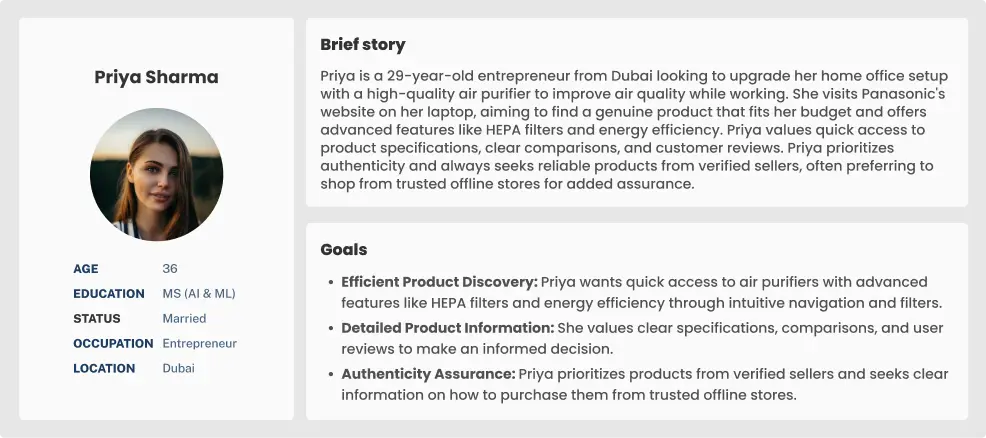
Due to the project's short 7-day timeline, I couldn’t conduct in-depth user research or access Panasonic’s data and analytics. However, understanding user behavior was crucial for evaluating the website’s UX. To bridge this gap, I organized a 30-minute session with six colleagues, where I introduced the Panasonic website and asked them to create personas based on their understanding of the product.
Each Persona included:
After gathering their inputs, I identified common patterns and used them to develop a proto-persona, ensuring a user-centered approach despite limited resources.
I analyzed actions related to finding a product and locating a store and mapped the user journey to identify pain points and improve the experience.
Homepage
Products Page
Product Details
Retailers
Store Locator

High Piority

Medium Piority

Low Piority
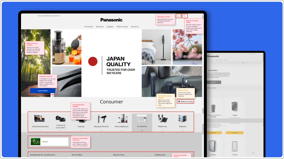
Combine the products and categories of Consumer and Business related products into one unified navigation bar where users can find everything
Prioritize the navigation bar by placing it at the top of the page, ensuring it is immediately noticeable when users open the website.
Implement a highly functional, prominent, and efficient search feature to help users quickly find their desired products.
Add interactive sections like Featured Products, Panasonic Campaigns, etc., to boost user engagement and ultimately improve conversion rates.
Reduce the number of blog posts on the homepage, as they take up valuable screen space without adding significant value.
Focus on adding buttons and elements that drive users towards the core action, rather than distracting them with multiple secondary CTAs.
The "About Us" section contains repetitive links, making it redundant. This space could be better utilized for other sections.
Reposition and redesign CTAs to make them more prominent, ensuring they are easily noticeable and not overlooked.
High Piority
Medium Piority
Low Piority
Reorder the content to prioritize showing products first, with additional details like the air purifier’s use placed at the end.
Add multiple filters to allow users to refine list of products based on their preferences, helping them easily navigate to product of their choice.
Add a comparison feature allowing users to compare different products, helping them make informed decisions based on their needs.
Use bullet points, tags, chips, spacing, and varied font sizes for product features and descriptions in each product card to make the information easily scannable.
Price is a crucial factor in a user's purchasing decision. Since multiple retailers offer the product, display the price range to help users make an informed choice.
Add a secondary CTA, such as "View Product Details," on each product card to clearly guide users to the detailed product page.
Add text labels to CTAs with only icons, like "Wishlist," to clarify the actions users are taking. There's ample space available to accommodate the text, making the interface more user-friendly.
Add sections like "Frequently Bought Together" and "Similar Products" to encourage users to explore and purchase additional items.
Add sections like "Frequently Bought Together" and "Similar Products" to encourage users to explore and purchase additional items.
High Piority
Medium Piority
Low Piority
An industry-standard product detail page typically includes high-quality product images using carousels or lightboxes, concise product features in bullet points for easy scanning, and expandable/collapsible menus for detailed specifications. The page also prioritizes key information such as pricing, availability, and prominent CTAs.
Rearrange content to prioritize key information such as pricing, features, and CTAs at the top. Make secondary information like product specs or additional details accessible but not overwhelming.
To establish trust with users, include customer reviews and star ratings, showcasing feedback from other buyers to help users make informed decisions.
Keep the primary CTA easily accessible throughout the page, so users can take immediate action when they decide to purchase, without having to search for it.
Rename the "Shop Now" button to something more descriptive, like "Find Retailer," to accurately reflect the action users will take, which is finding nearby or online stores rather than purchasing directly.
Place the secondary CTA next to the primary one to allow users to easily choose between related actions without having to search for options.
Add personalized sections such as "Just for You", "You May Also Like" to suggest products based on your preferences, creating a more engaging and tailored shopping experience.
For product-specific support, redirect users to a dedicated support page tailored to their product instead of a generic support page.
Get rid of excessive white space in various sections to create a more compact and visually appealing layout, improving content visibility and user experience.
High Piority
Medium Piority
Low Piority
Based on the user’s location, products available on online platforms can be displayed directly on the product details page. For offline purchases, a CTA such as “Buy from Retailer” can be added to help users locate nearby stores for making the purchase.
High Piority
Medium Piority
Low Piority
Users have already decided what they want to buy by this stage. Asking them to reselect the category and subcategory can be frustrating. Instead, the fields should automatically populate based on their previous selections.
Since users have navigated through multiple pages to reach the final one, they should always be aware of their current location and have a clear path to retrace their steps.
Include stock availability status or a note advising users to call the store to check product availability before visiting.
Include store opening and closing times on each store card to inform users of the best times to visit.
The different colored pin icons represent various types of stores, such as retail outlets, Panasonic showrooms, and others. Add a representation to explain which color corresponds to which store type.
The UX audit of Panasonic's website found several issues that make it hard for users to find products and know where to buy them. Problems like a weak search function, limited filters, multiple navigation, and complicated product pages slow down the shopping process. Implementation of these changes will improve the shopping experience, leading to more sales and higher conversions.