Redesign and develop the landing page of ChatGPT
Organised by WebXcommunity
Organised by WebXcommunity
This case study focuses on a four-day design & development work for a competition organized by WebXcommunity, in which the goal was to redesign and develop the landing page of ChatGPT. One notable requirement was the inclusion of a live website as part of the submission. Participants were given the freedom to choose any platform or coding approach, and responsiveness was not a mandatory criterion for the website.
Individual
4 days
March 2023
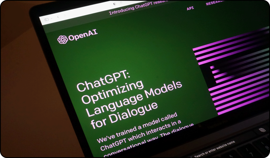
Redesign and develop the landing page of ChatGPT which is currently featured on OpenAI website.
Understanding the current landing page
Define the goals of landing page
Research
Create designs
Develop using HTML and CSS
There are two main types of users for ChatGPT landing page. The first type consists of individuals who have never used ChatGPT before and are accessing it for the very first time. The second type comprises tech-savvy users who are specifically interested in learning about ChatGPT. It's worth noting that users who are already familiar with the platform often bypass the landing page and directly access the ChatGPT conversation interface, where they can ask questions and receive responses.
Prompt users to try Chatgpt and educate users about what chatgpt is(hero section), what it is capable of doing (samples), how it works(methods), its limitations, how their model is safe and reliable(iterative deployment)
In order to redesign a website's homepage effectively, I started with a quick analysis of the content, layout and user interface of the existing homepage to determine what works well and what needs improvement.
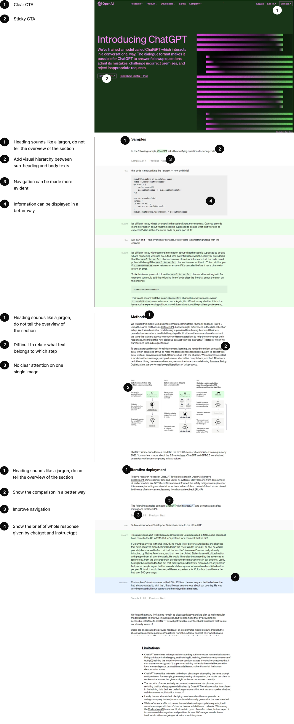
Informative.
Contrast between texts and background. (Black on white contrast).
Hyperlinks provided for some technical terms which tells their meanings.
Shows actual responses of Chatgpt in different sections.
Transparent with the users by telling about its limitations.
CTA’s are not evident.
Page is not engaging
Lacks in proper hierarchy.
Hyperlinks open in new tab. It breaks the flow. Probably give a small definition on hover over the hyperlink.
I believe that learning about ChatGPT will be easy for tech savvy users if the information presented on the landing page is clear and engaging.
I believe that navigating to Chatgpt’s conversation interface will be easier if new users are successfully able to notice the clear and evident CTA buttons
Encourage new users to try out ChatGPT while also offering clear and engaging information for those interested in learning about its features.
To better understand how similar goals are being achieved, I reviewed the landing pages of two competitors named Jasper AI and Writesonic providing a service similar to ChatGPT. This allowed me to examine how they showcased similar sections and attained comparable objectives.
Clean and modern visuals
Not using too much of technical jargons
Showing actual interface of their product and how a user can interact with it.
Showcase real life scenarios in which their product could be used.
Builds credibility and gives social proof by showing testimonials and reviews from their users and individuals coming from established companies
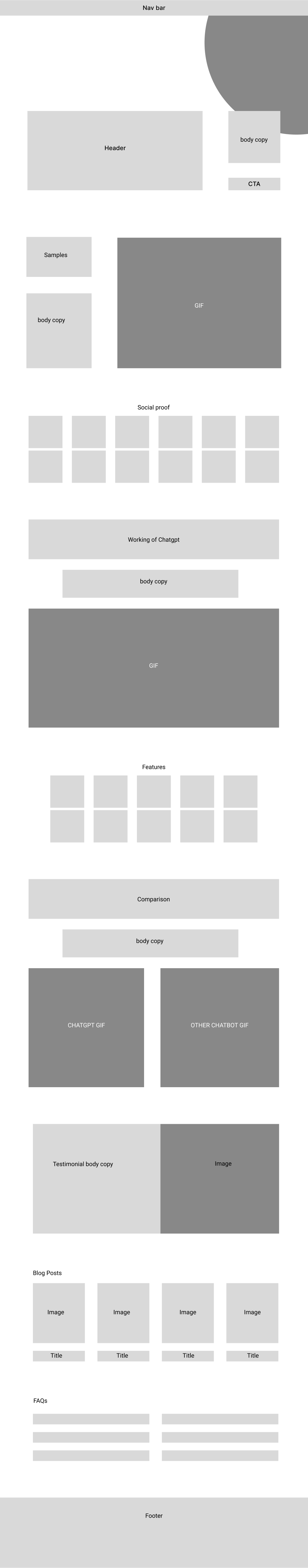
Based on the new goals, strengths and weaknesses i started thinking of scope of improvements and what different sections should we have in the new landing page. Using these factors as a guide, I created low-fidelity wireframes to visually represent the proposed design.
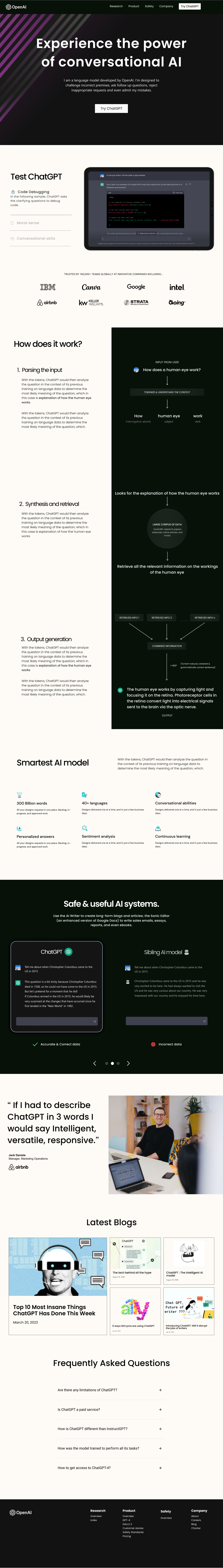
After working four days of hard work on the redesign and development of the landing page, I successfully submitted my MVP, with just a few minor changes left to address. To my pleasant surprise, my efforts were rewarded with the 1st-position among the participating designers in this design challenge.